Brand assets
Logo mark, wordmark lockups, color and type specs, and social preview files for SumoSign. Use the Inter Tight S mark for favicons and avatars; use the SumoSign wordmark in nav, footers, and press.
Logo mark
The primary mark is an Inter Tight S on an ink rounded tile — outlined as a vector path so it matches the wordmark with no font dependency. Use the dark tile as the default favicon and app icon; use the light tile or bare glyphs when the surface needs the inverse.
Glyph
Inter Tight at weight 600. Capital S only — never redraw or substitute another typeface.
Tile
Ink #1e1e1e with paper-bright glyph #f9f9f9. Corner radius ~22% of the tile edge.
Clear space
Keep padding equal to the stroke width of the S on all sides. Prefer the tiled mark at small sizes (16–32px).


X / social avatar
Same Inter Tight S on full-bleed ink — no rounded tile, so X's circle crop stays clean. Upload the 800×800 PNG as the profile photo.

Wordmark
Site nav and footer use the text wordmark SumoSign — capital S, no space. Inter Tight at weight 600, letter-spacing −0.03em. Do not replace the wordmark with the S mark in the nav.
Typeface
Inter Tight at weight 600, letter-spacing −0.03em. Matches .ld-nav__brand on the live site.
Color
Ink #1e1e1e on light backgrounds. White #ffffff on charcoal or black.
Clear space
Keep padding equal to the cap height of the wordmark on all sides. Square lockups include built-in padding for partner directories.
Square wordmark lockups
512 × 512px wordmark-only squares for partner directories and press kits when a full name is required. Prefer the logo mark for favicons and app icons.

Horizontal lockups
Wordmark-only SVGs for nav-style placements, email headers, and press materials.




Color palette
One saturated accent (electric blue) for UI: blue is reserved for primary actions and interactive states — not for the logo mark. Everything else is warm neutrals. The artwork carries its own two-plate print ramp (ultramarine, taupe, warm paper) — use those inside artwork layers only, never as UI fills.
Typography
Inter Tight for display headlines, the wordmark, and the logo mark glyph. Inter for body copy. JetBrains Mono for eyebrows and code. Keep the mark and wordmark in the same family — never mix in a serif.
Enterprise-class signing
API-first e-signatures on your domain, built for teams that send a lot of contracts.
Risograph artwork
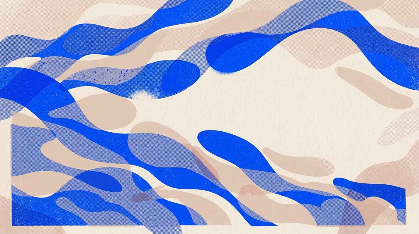
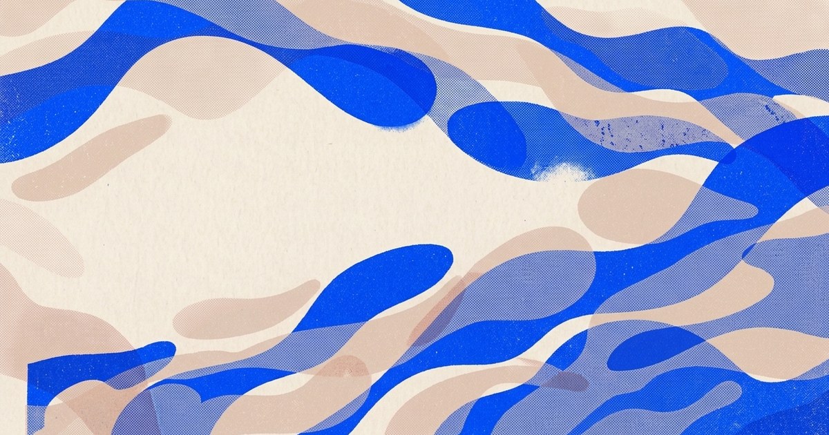
The cascade illustration is the brand's artwork direction: two riso plates, ultramarine #0048ec and taupe #dec4b3, printed on warm paper #f2e9da— visible halftone dots, hard plate edges. Use it as a backing for social, blog, and slide surfaces. Crop so the cascade bleeds off an edge, and veil any type layer with the artwork's own paper hex so the seam disappears.

Open Graph image
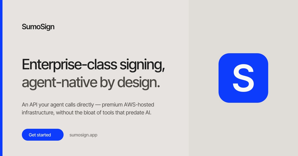
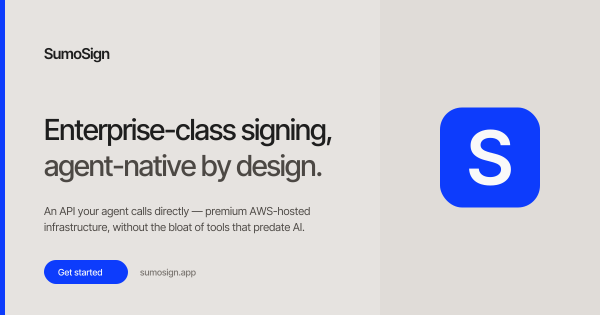
1200 × 630px social preview laid over the risograph cascade artwork: the cascade bleeds in from the right, a warm paper veil keeps the left legible, and the electric blue rail, CTA pill, and logo mark stay on top — same hero copy as the homepage. Used in site metadata for Twitter, LinkedIn, Slack, and Discord.

X profile header
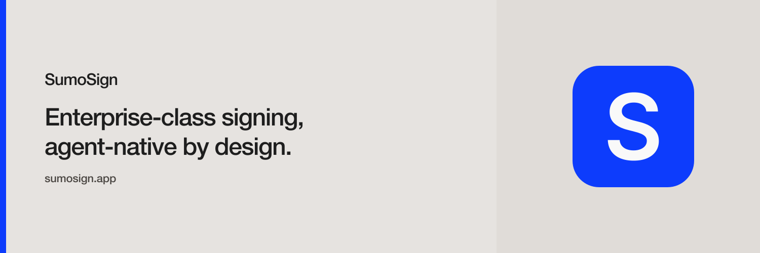
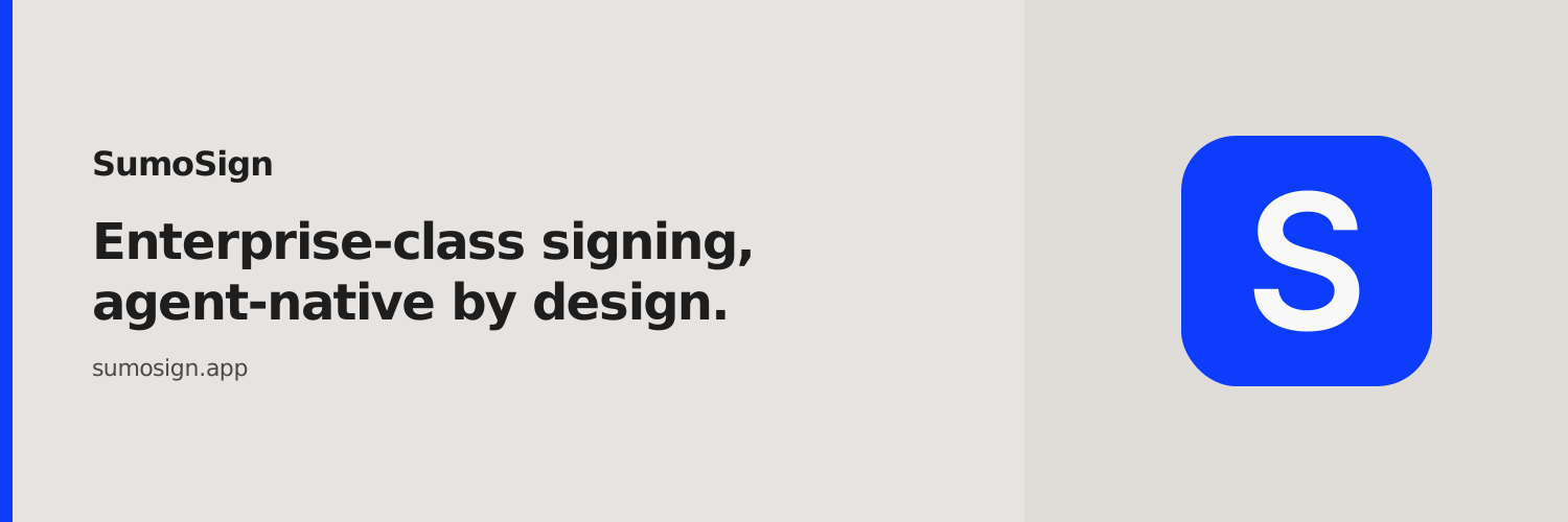
1500 × 500px banner for the X profile cover. Same risograph backing as the OG card, sliced to 3:1, with the wordmark lockup, headline, and domain — no CTA pill. Type stays inside the central 2:1 band and clear of the bottom-left corner, so X's avatar overlap and any legacy crop never clip copy. Do not upload the 1200 × 630 OG image here; X will crop it.

Favicon
SVG favicon using the dark tile mark. PNG fallbacks ship at 32×32, 192×192, and 512×512, plus a 180×180 Apple touch icon. Prefer the SVG in modern browsers.


Usage guidelines
Do
- Use the dark tile mark for favicons, app icons, and avatars
- Use the SumoSign wordmark in nav, footers, and press lockups
- Keep clear space around both mark and wordmark
- Use electric blue only for primary CTAs, links, and small accents
- Set og:image to 1200×630 and twitter:card to summary_large_image
- Back layering surfaces with the risograph artwork, veiled in its own paper hex
Don't
- Replace the nav wordmark with the S mark alone
- Redraw the S in a serif or any typeface other than Inter Tight
- Recolor the mark outside ink / paper / paper-bright / white
- Stretch, rotate, or add effects to the mark or wordmark
- Use lowercase, spaced, or abbreviated forms like "sumo sign"
- Set type straight onto the halftone cascade, or recolor the artwork plates